Monday, June 6, 2011

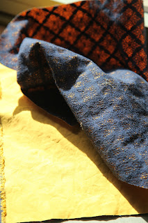
Photo shoot w// Donald Chung as Photographer.


Surface details and textures achieved with shadowing and scrunching textiles. The end result was quite successful.

A couple of notes

Check of resample box when resizing image. Make sure when you open image in photoshop that you change the format to CMYK. Change resolution to 150. This decreases the dimensions of the image. Think of pixels per inch.

In indesign remove stroke and fill from box, select within the box, then place the image. Save as jpeg if you want a compressed file. Place instead of paste.
Double click image link and it will update.
Go to prefilight menu in the bottom, it will tell you each error that your document
Overset text means the text box is not big enough for the text. You can click on the red symbol on the text box and create another text box with the rest of the text.
Highlight text, hold town shift then delete. This removes the extra returns on the text.
Create text box- go to type, insert special character, markers

Save as legacy file- export- save to desktop- change format to indesign marker

Tuesday, May 10, 2011

final textiles header

Fabric Header Design

Remaining with my coastal theme, I edited this picture of a surf board on the beach. The image was original vibrantly coloured, though this didn't fit with the rest of my textiles collection. Opacity was played with to achieve the colour of the text box on the back of the header.

Inspiration for swing tags

For my swing tag, i would like it to be rather small and simple. To make it more interesting i will have 3-4 separate tags on on one piece of cotton string.

I am also interested in how Ripcurl uses the phrase 'the search' as part of their advertisement. My own interpretation of this is 'freedom in flight'. I chose this as it relates both the bird motif and the target market of the label.

I want to appeal to people that are free spirited and appreciating life, as this is what I represent with my label. To continue with my use of recycled paper, I would like to create garments that are created with natural, eco-friendly yarns and fabrics.



logo designs

For my logo design i have incorporated the blue bird image by suggesting it is carrying the text. Using one of my original logo designs, i have traced around the font and set this as the top layer of my logo. Behind it I have used the original font, but played with the transparency. This has created depth and a more established logo design. I then played with how the letters sat, this made it more apparent that the bird was carrying the text.

Paper Stock


I would like my paper stock to incorporate brown paper and card, and possiby recycled paper. I think this will work well with my label as the organic earthy colours create a welcoming and warm appearance, and to me are more interesting than a plain white paper stock. I'm also interested in using a paper that has surface detail and texture, as this will add interest to my rather simple stationary designs.

Blue bird inspiration

Vibrant blue colours and sketchy drawn lines would be interesting to explore within my logo design. A childish cartoon style image could be interesting to use, and could also create a trademark image of the brand- relating to the laid back surf style that I am exploring.

Tuesday, April 12, 2011

The Life Aquatic: Abbey Lee Kershaw


This fashion shoot by Max Doyle in Vogue Australia March 2010 perfectly outlines my label aesthetics.

Surf and fashion merging together.